Remember when dashboards were just endless rows of numbers? They looked like the Matrix, but instead of feeling like Neo, most of us just felt… confused. Yet, we squinted at those spreadsheets, trying to extract meaning from the chaos, hoping to make that one critical decision before our second cup of coffee.
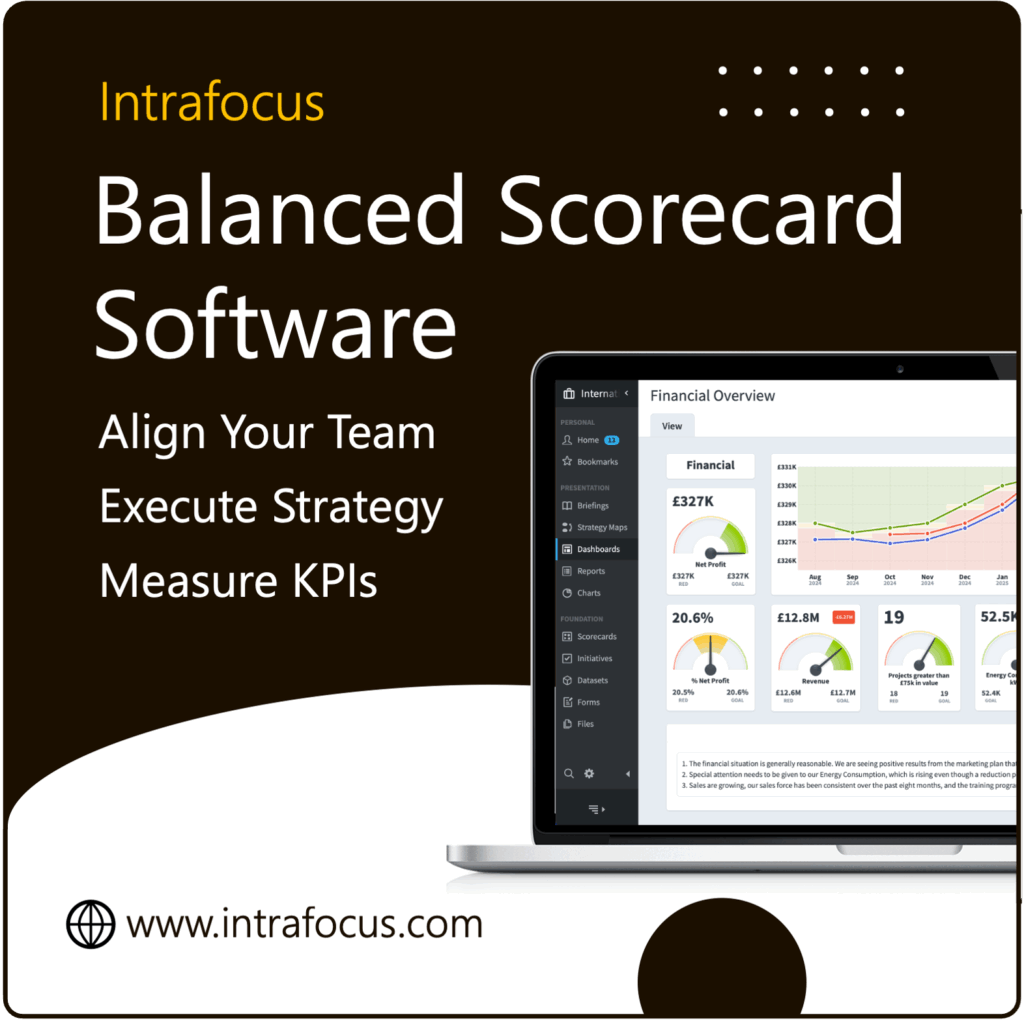
Recommended: KPI & Balanced Scorecard software | Intrafocus — implementation, training, and support.
Thankfully, dashboards have come a long way. Today, they’re the heart of business strategy, helping teams align, track progress, and make smarter decisions. But even with these advancements, many dashboards still feel static—trapped in the past. Spider Impact has always provided the tools to create amazing dashboards, and V5.7 brings a new set of revolutionary widgets, allowing you to tie your cool designs to your data.
What does this mean for you and your business? Whether you’re a small startup navigating growth or a well-established company striving for more agility, the new features in Spider Impact V5.7 promise to make your dashboards informative and downright engaging.
In this article, we’ll dive into the key updates in V5.7, explore the magic of infographics, and show you how these tools can revolutionise your approach to strategy. Oh, and we’ll include a few laughs along the way—because if you can’t have fun with your data, what’s the point?
What’s New in Spider Impact V5.7
Imagine if your dashboards weren’t just tools but works of art—dynamic, interactive, and connected to your business. The headline feature? Shape and line widgets that turn ordinary dashboards into visual masterpieces. Think of PowerPoint design tools, but on a whole new level, tied directly to live data. Yes, it’s as cool as it sounds.
Let’s break it down. With the new shape and line widgets, you can:
- Choose from 40 professionally designed shapes. No more hunting for the perfect arrow or box.
- Customize everything. Colours, gradients, outlines, and opacity. Your dashboards will look so good that they might win a design award.
- Add dynamic text. Imagine numbers and metrics updating in real time without you lifting a finger.
- Connect shapes to live data. Tie a sales target to a progress bar or link a customer satisfaction score directly to a visual trend line.
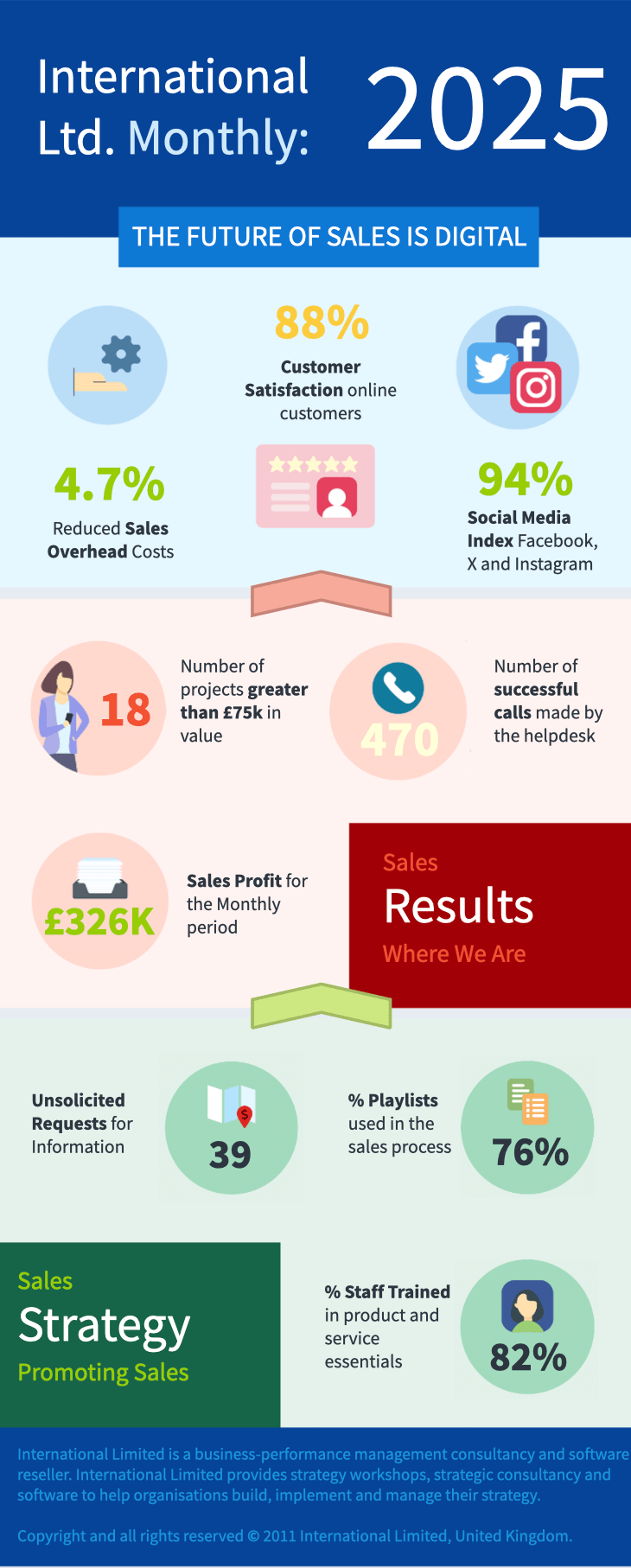
- Create infographic-style visuals—the kind that makes board members say, “Wow, I actually understand this.”
Here’s how businesses are already putting these tools to work:
- Healthcare: Imagine a hospital using real-time patient flow diagrams to identify bottlenecks in emergency rooms. There would be a red line here and a green box there, and lives would be saved faster.
- Retail: Imagine a supply chain visual for a clothing brand, showing product movement from factories to stores. If there’s a delay, the dashboard updates instantly—no frantic phone calls are needed.
The beauty of this feature is how it bridges gaps. Traditionally, scorecards, initiatives, and datasets lived in separate silos, like coworkers who only nod in the breakroom. Now, Spider Impact V5.7 unites them, creating a seamless flow of information.
And it’s not just about making data look good (although it does). These tools empower businesses to act on insights in real time. With dashboards this intuitive, you won’t just present data—you’ll tell a story, solve problems, and inspire action. Let’s be honest: when was the last time a spreadsheet did that?
Infographics as a Communication Medium
Let’s face it—when was the last time you got excited about a bar graph? Probably never. Enter infographics: the superhero of data visualization. Infographics take boring data and make it pop, transforming dry statistics into vibrant stories that are easy to understand and, dare we say, fun.
Why are infographics so effective? First, they simplify complexity. Instead of wading through pages of dense reports, you get clear, concise visuals that immediately hit you with the key message. It’s like having a translator for data—turning accountant-speak into plain English.
Second, they grab attention. Imagine sitting in a meeting right before lunch. Which are you more likely to notice: a detailed table of numbers or a colourful pie chart showing revenue streams? The pie chart wins every time. Infographics tap into our brain’s natural love of visuals, making information stick longer than that spreadsheet you’ve already forgotten.
And let’s not forget their versatility. Businesses across industries use infographics to communicate better:
- Finance: Banks break down complex risk analyses into bite-sized visuals for board meetings. Imagine an arrow showing risk trends—green for good, red for bad. Simple and effective.
- Technology: Startups use growth charts and dynamic visuals in investor pitches to get that all-important funding.
- Retail: Infographics help brands showcase customer insights, like shopping trends and preferences, in a way that resonates.
Here’s where Spider Impact V5.7 comes in. With its new shape and line widgets, you can create infographic-style dashboards that update in real time. Picture this: a strategy map showing your business goals, KPIs, and progress, all linked to live data. No more scrambling to update charts five minutes before a meeting.
Infographics also help cut through the noise. When done right, they are memorable, shareable, and, most importantly, actionable. They don’t just present data; they tell a story. And stories are what drive decisions.
So, whether presenting to a room full of executives or explaining metrics to your team, infographics are your secret weapon. Thanks to Spider Impact V5.7, you don’t need a graphic design degree to create them.
Using Spider Impact to Create Dashboards
Creating a dashboard in Spider Impact V5.7 isn’t just easy—it’s downright enjoyable. Even if your artistic skills peak at stick figures, this software will have you designing strategy maps and infographics that look like they belong in a gallery (or at least a boardroom).
Let’s start with a strategy map. Imagine you’re leading a mid-sized retail company and need a clear visual of your goals and progress. With Spider Impact, you begin by dragging shapes (arrows, boxes, or circles) onto your dashboard. These shapes aren’t just placeholders. You can link them to real-time data, like sales figures or inventory levels, so they update automatically.
- Pick a Shape: Say you want to track revenue. Choose a rectangle, fill it with your company colors, and title it “Revenue Targets.”
- Add the Data Connection: Connect the shape to your sales dataset. Now, whenever your revenue changes, the rectangle updates automatically.
- Make It Pop: Add a gradient or outline. Not because you have to, but because it looks awesome.
Now, let’s move to an infographic-style dashboard. Picture a logistics company tracking delivery efficiency. With Spider Impact, you can create a flowchart showing the journey from warehouse to customer. Arrows change colour based on delivery times—green for on-time, red for delays. Need to present this in a meeting? No problem. The dashboard updates in real-time, so everyone gets the latest information.
Other examples include:
- Education: Schools use dashboards to visualize enrollment trends. Watch the number change as intake increases.
- Healthcare: Hospitals map patient care processes with live updates on waiting times.
The interface is so intuitive that even a novice can look like a pro. One user joked, “I’m no designer, but with Spider Impact, I’m basically the Michelangelo of dashboards.” (OK, maybe Michelangelo didn’t have gradients, but you get the idea.)
Spider Impact V5.7 turns dashboard creation into more than a task—it’s an opportunity to tell a compelling story. By connecting shapes and visuals to live data, you’re not just presenting information but creating an experience.
The Future of Dashboard Visualization
Spider Impact V5.7 isn’t just an update—it’s a leap forward in how businesses visualize and communicate their strategies. With powerful tools like shape and line widgets, real-time data integration, and infographic-style dashboards, this software turns your data into a living, breathing story.
The future of dashboard visualization is here, and it’s intuitive, interactive, and impactful. Whether you’re a retail business tracking customer trends, a healthcare organization optimizing patient care, or a finance team making sense of KPIs, Spider Impact V5.7 has the tools you need to succeed.
With Spider Impact V5.7, your dashboards won’t just inform—they’ll inspire. It’s time to leave clunky spreadsheets in the past and embrace the tools that make your data work as hard as you do. After all, why settle for good when you can have exceptional?
If you are implementing or thinking about implementing a Balanced Scorecard, then please take a look at out Balanced Scorecard Software, Spider Impact.


