Welcome back to our strategy refresher series for the start of 2020. After reviewing KPIs, we’ll now turn out attention to the KPI dashboard. Check out our sample dashboards page
What is a KPI dashboard?
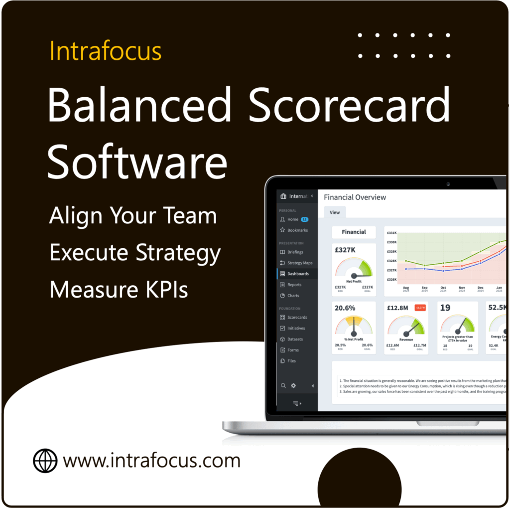
When you’re going to the trouble of gathering, measuring and evaluating your KPI data, you need to make sure it gets to your internal audience in a format that they can read. KPI dashboards are used as part of the end-of-month reporting. Managers are familiar with monthly business reports and the dashboard approach makes data presentation immediate, fresh and intuitive.
How are dashboards created?
Some businesses still create dashboards – laboriously – using manual processes. But the majority of organisations now look to automate the process with software tools that make a KPI dashboard easy to create, update and share. Many systems also make it easy to display the finished product on local TV screens, the company intranet and online to a private audience.
The benefits of automated dashboard software
A KPI dashboard creation system such as Quickscore provides an intuitive interface for rapid creation of graphs, tables and other graphical widgets, and then populates the content in real-time. Immediate trend data is provided, concerns are flagged via the RAG system and readers are able to interrogate areas of interest and to drill down to detailed sub-levels of information.
What does a great KPI dashboard look like?
A monthly report should be highly visual, and give a snapshot of the organisation’s overall performance, with historic trends to see changes over time. Supporting dashboards should provide views for individual functional areas and departments.
So, let’s now look at the elements of a great dashboard. Essentially, the three key rules to keep in mind is that a dashboard should present business performance markers:
- Visually – for easy reading
- Intuitively – for easy interpretation
- Contextually – for rapid understanding.
This final attribute, context, is perhaps the most important of all, as the dashboard needs to convert raw data into user-friendly information that managers can understand, absorb and analyse for better decision making.
KPI Dashboards also need to be simple. The key purpose is to immediately flag up key trend and outcomes – not to overwhelm the reader with gimmicks and a mass of charts!
Common errors when creating KPI dashboards
Creating a great business dashboard takes time and you won’t get it right overnight. The best approach is to take your time, start with the basics and allow your format to evolve over time. Here are some common errors that the Intrafocus team has seen over the years.
- Trying to satisfy everyone – you never will so don’t even try! Focus on your target user group and seek to understand what they really need. Remind stakeholders as necessary that the dashboard can evolve over time as feedback trends bed in.
- Getting caught up in detail – focus on the big picture and always ask what you are trying to achieve with your dashboard. This is a piece of strategic and high-level reporting (with the option to drill down for detail) – so don’t add too many widgets, gadgets and distracting gizmos that take away from the main focus.
- Going overboard – It’s tempting to add lots of colour, fonts and design elements, but apply the KISS (Keep It Simple, Stupid) philosophy to keep things clean. The easier your dashboard is to read, the more people will use it.
- Providing ‘raw’ data – remember the rule about contextualisation. Provide text information that puts figures into place to save your target audience time.
- Overdoing your alerts – RAG systems are useful, but you’ll need clear thresholds to avoid overwhelming your readers with too many flags.
- Focusing on form over function – stakeholders often get wrapped up in the aesthetics of a dashboard and try to release their inner graphic designer! As the dashboard creator, you must focus on the problems that the dashboard is trying to solve and then pick the appropriate graphic representations.
So with this in mind, what are some basic points for good dashboard practice.
Key takeaways
- Use an automated software system to facilitate the process, reduce user errors and deliver a quality product which adds value.
- Use a single screen presentation to show a clear snapshot of KPIs and key business performance data
- Allow users to quickly find the detail that they need, using different types of chart and graph, with text as required.
- Choose display media which make sense for the content. For example, sales dashboards tend to include pie charts and financial dashboards use line graphs.
- Flag up focus areas and key points with a RAG status and links to further commentary
- Create a simple, on-brand design which is consistent and clutter-free.
Sample KPI dashboards
Want to see what a great dashboard looks like? Check out our sample dashboards page to see some examples of good practice
Find out more
The team of strategy consultants at Intrafocus are here to help. From strategy kick-off workshops through to dashboard creation support, we are here to assist. Contact us for a no-obligation chat about your needs and to find out more.


