It easy to build an XmR Chart is a KPI Software package like Spider Impact
XmR Charts fall under the category of control charts used to monitor industrial or business processes. The X stands for ‘Individual’. In an industrial process this may be a quality of an item produced (or a batch of items). For example the quality of a ball bearing. In a business process this may be a Key Performance Indicator such as customer satisfaction.
The XmR chart is actually two charts. The X is the data point being measured and mR the Moving Range which is the difference between consecutive data point measurements.
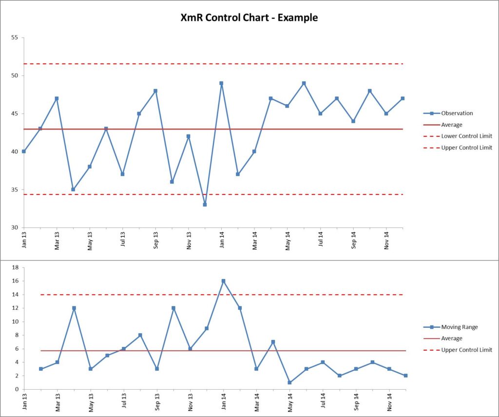
An XmR chart might look something like this:
The upper chart (X-Chart) displays the data-points over time (Observation) together with a calculated average (Average). The calculated average is then used to calculate the Upper and Lower Control Limits. The lower chart displays the Moving Range (mR-Chart) with its Average and Upper Control Limit. There is no lower control limit as the value of the difference between consecutive observations is recorded as an Absolute Value (positive number). Go to Wikipedia for a quick overview of how the calculated values are calculated. Douglas Montgomery’s book, Introduction to Statistical Control, provides much more detail if you are interested.
The XmR chart, through the upper and lower control limits, provides information to determine what a natural process limit is. When looking at business performance, we all too often over-react when a performance measure changes without considering the ‘natural’ limits of change. All performance indicators change, it is the natural order of business. Understanding the natural limits of change is vitally important to the successful management of a business.
There are several things we need to consider. Firstly, there will always be special cases. In the chart above, the December 2013 metric is an ‘outlier’. It has fallen outside the natural limits of the of the process variation. It is also a single instance. The causes of single instances are usually very easy to determine. It may be a seasonal variation; it may be the result of a natural disaster. Whatever it is, it can usually be discounted very quickly and not considered a cause for concern.
Secondly, the data is only valuable when there are 7 or more data points. Without 7 data points, the upper and lower control limits cannot be accurately calculated. However, in business we can rarely wait 7 months to take action. As a rule of thumb, if there are 3 or 4 data points in a row that can be observed as moving away from the Average, action should be taken.
Thirdly, although there is a very strong case to always use both charts contained within the XmR chart, the whole chart can be confusing to a general business user. Great value can be gained by using the X part of the XmR chart. Stacey Barr, the performance measure specialist is a great promoter of using the X-Chart. See Three Things You Need On Every KPI Graph.
Lastly, the duration of an XmR chart need to be revisited when a ‘long-run’ of data remains above or below the Average line. In the example above, we can see that from June 2014 onwards all of the data points are above the Average line. This clearly indicates there has been a change in the process. We can also see that the variation between the data is less. If this group of data was recalculated as a separate XmR chart the upper and lower control limits would be very different.
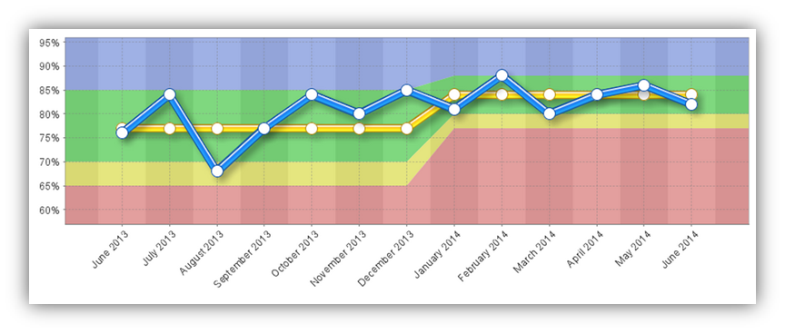
The chart above was created using standard spreadsheet techniques. Adding the axis and values and calculating the limits is a relatively simple thing to do. However, using spreadsheets can be fraught with difficulties if the information has to be provided to a group of people or it is part of a much larger business performance activity. If this is the case, then turning to a software solution is probably a better alternative. There are many software packages available. They can be configured to take into account things like ‘long-run’ effects and display results that provide a greater level of information. For example, the chart above (using the X-Chart portion) might look like this:
Here we can see the upper and lower control limits as the ‘green’ portion of the chart. The Average is the yellow line and the data the blue line. An additional lower limit, in the form of an amber band has been added providing the familiar red/amber/green (RAG) business parameters. The chart has also re-formatted the ‘long-run’ set of data points and narrowed the upper and lower control limits.
Whatever system is used to look at performance data, the key is to look at the data as a whole and over a reasonable duration. This control chart provides far better analysis of the data as compared to traditional trend lines or month on month or year on year comparisons. There is, of course, still the need to take into account associated data and other external or internal factors.


